*以下技巧均源自于Lea Verou所著《CSS Secrets》
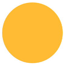
在css上構造圓形只需要將border-radius屬性值設為邊長的一半即可。
<!DOCTYPE html>
<html lang="en">
<head>
    <meta charset="UTF-8">
    <title>border-radius</title>
    <style>
        .borderRadius{
            display: inline-block;
            background: #fb3;
            min-width: 200px;
            height: 200px;
            line-height: 200px;
            border-radius: 100px; /* 邊長的一半 */
            box-sizing: border-box;
            padding:0 5px;
        }
    </style>
</head>
<body>
    <div class="borderRadius">
       <div class="innerTxt"></div>
    </div>
</body>
</html>
顯示效果如下:
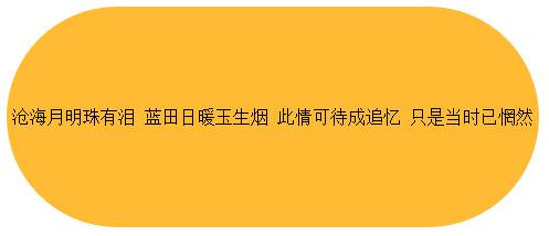
以上布局當我們在innerTxt中添加過多的內容時,會得到如下的效果:
如果我們想要一個自適應的橢圓的話,那么border-radius中就不應該是一個固定的值,
當我們將border-radius設置為50%時,顯示效果如下:
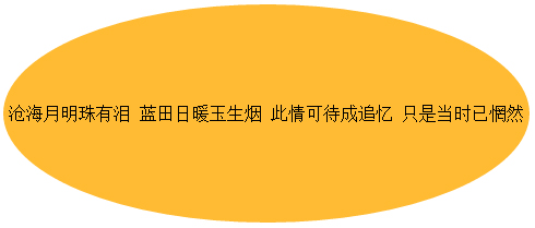
這樣就變成了一個自適應的橢圓了。
這里我們全面介紹一下border-radius的屬性,border-radius是一個簡寫屬性,
它的展開式是border-top-left-radius、border-top-right-radius、border-bottom-right-radius、border-bottom-left-radius。
它還有一個鮮為人知的特性:border-radius可以單獨指定水平和垂直半徑,
只要用一個斜杠( / )分隔這兩個值即可(圓形圓角水平和垂直半徑相等,可以合并)。
結合這這些特性來看的話,border-radius:50%;的詳細展開應該是border-radius:50% 50% 50% 50%/50% 50% 50% 50%。
接下來我們根據已知的圓角特性發揮想象構建各種各樣的圖形。
border-radius: 50% / 100% 100% 0 0(當圓角半徑不滿4個時,css會自動幫你重復)
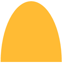
border-radius: 100% 0 0 100% / 50%;
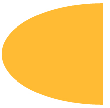
border-radius:
 糖果按鈕
糖果按鈕
當實際應用時,充分利用圓角的特性加上一些想象,就可以構造出可愛的糖果按鈕效果了。
.borderRadius{
            display: inline-block;
            background: rgba(255,160,220,.8);
            box-shadow: hsl(0, 0%, 60%) 0 3px 3px;
            min-width: 200px;
            height: 100px;
            line-height: 200px;
            border-radius: 50% 10% / 100% 10%;
        }
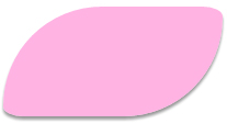
.borderRadius{
            display: inline-block;
            background: rgba(157, 255, 127, 0.8);
            box-shadow: hsl(0, 0%, 60%) 0 3px 3px;
            min-width: 160px;
            height: 100px;
            line-height: 200px;
            border-radius: 20% 20% 12% 12%/ 80% 80% 12% 12%;
        }
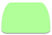
.borderRadius{
            display: inline-block;
            background: rgba(167, 255, 250, 0.8);
            box-shadow: hsl(0, 0%, 60%) 0 3px 3px;
            min-width: 160px;
            height: 100px;
            line-height: 200px;
            border-radius: 20% / 50%;
        }
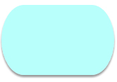
是不是挺可愛的,這樣就不用經常勞煩美工同志做圖啦,
但是在應用之前一定要確認適用的游覽器支持圓角屬性。

【 微信掃一掃 】