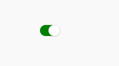
之前阿里電面的時候問的一個問題,今天抽時間做了個demo。
html結構
    <div class="container">
        <div class="bg_con">
            <input id="checked_1" type="checkbox" class="switch" />
            <label for="checked_1"></label>
        </div>
    </div>
css代碼,:before負責顏色,:after是那個白色小圓點,切換時的過渡效果用css3的動畫實現。
.switch{
        display:none;
    }
    label{
        position:relative;
        display: block;
        padding: 1px;
        border-radius: 24px;
        height: 22px;
        margin-bottom: 15px;
        background-color: #eee;
        cursor: pointer;
        vertical-align: top;
        -webkit-user-select: none;
    }
    label:before{
        content: ’’;
        display: block;
        border-radius: 24px;
        height: 22px;
        background-color: white;
        -webkit-transform: scale(1, 1);
        -webkit-transition: all 0.3s ease;
    }
    label:after{
        content: ’’;
        position: absolute;
        top: 50%;
        left: 50%;
        margin-top: -11px;
        margin-left: -11px;
        width: 22px;
        height: 22px;
        border-radius: 22px;
        background-color: white;
        box-shadow: 1px 1px 1px 1px rgba(0,0,0,0.08);
        -webkit-transform: translateX(-9px);
        -webkit-transition: all 0.3s ease;
    }
    .switch:checked~label:after{
        -webkit-transform: translateX(9px);
    }

    .switch:checked~label:before{
        background-color:green;
    }

【 微信掃一掃 】